How to Decorate Shelves That Look Designer (without Trying Too Hard)
Got shelves that feel more “storage unit” than “styled moment”? Let’s fix that. With a few smart moves—and a little editing—you can make any shelf look intentional, layered, and magazine-worthy. No fancy budget required, just good vibes and a plan.
1. Start With A Vibe: Your Shelf’s Mini Mood Board
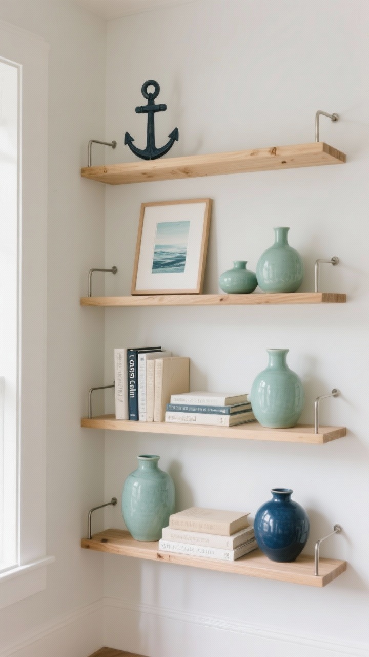
Before you start tossing stuff on a shelf, set a direction. Think: coastal calm, earthy minimal, bold eclectic, or vintage library. Picking a vibe gives you a filter so your shelf doesn’t end up a chaotic souvenir dump.
Choose Your Palette
- Anchor colors: 1–2 neutrals (white, black, natural wood).
- Accent colors: 2–3 hues that repeat across objects—ceramics, book spines, art.
- Metal/wood tone: Keep finishes consistent for cohesion.
FYI: Repetition is your best friend. When the same colors pop up in different pieces, everything instantly looks curated.
2. Build A Base: Books, Big Pieces, And Negative Space
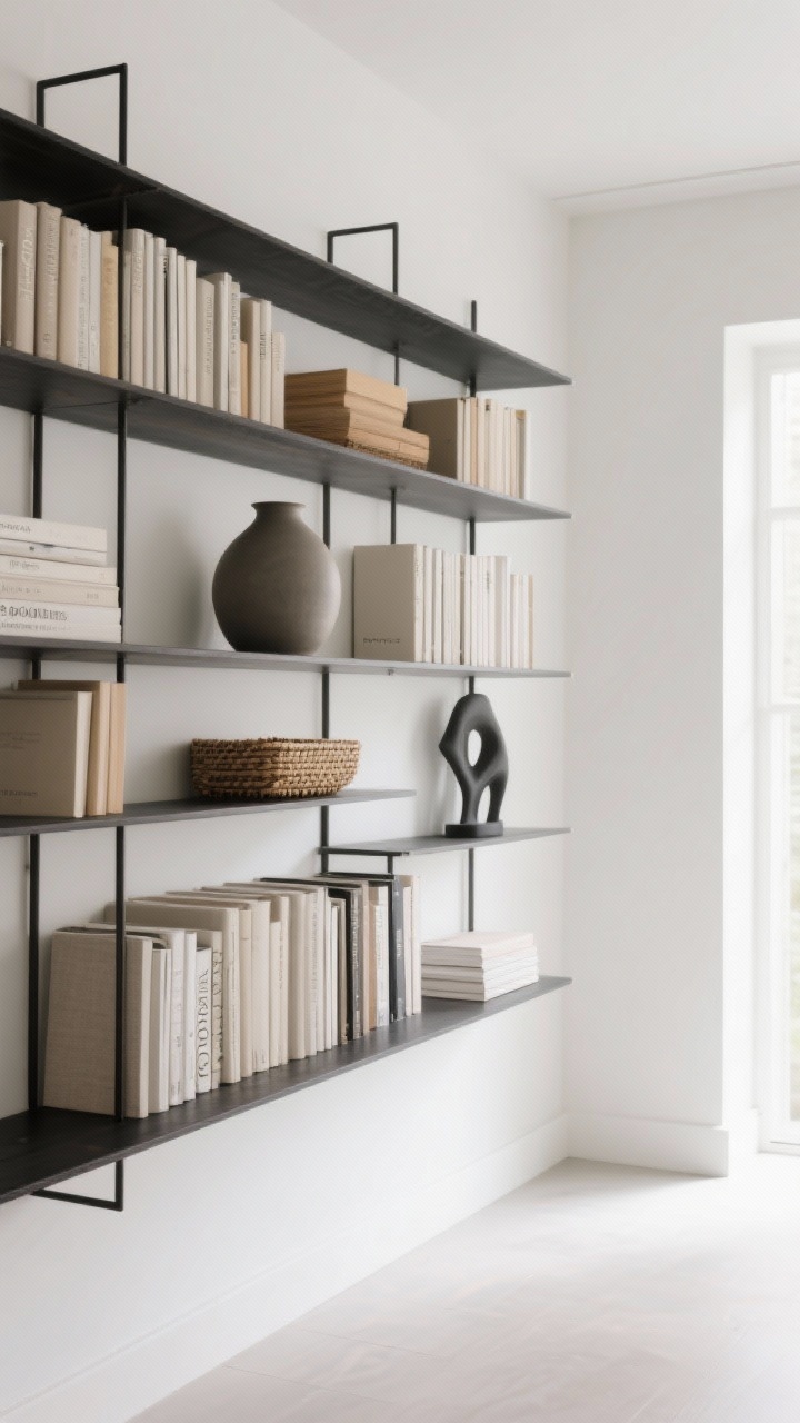
Start with the “bones” so the smaller pieces don’t feel lost. You want a mix of visual weight and breathing room, like a well-composed photo.
Place The Anchors
- Books: Stack horizontally and vertically to create levels. Remove busy dust jackets if needed.
- Bulky items: Large vases, baskets, or sculptures belong first—one per shelf is often enough.
- Negative space: Leave some areas blissfully empty. It makes the styled parts shine.
Pro tip: If your shelves are deep, push a few items slightly back and pull others forward. That subtle stagger adds dimension.
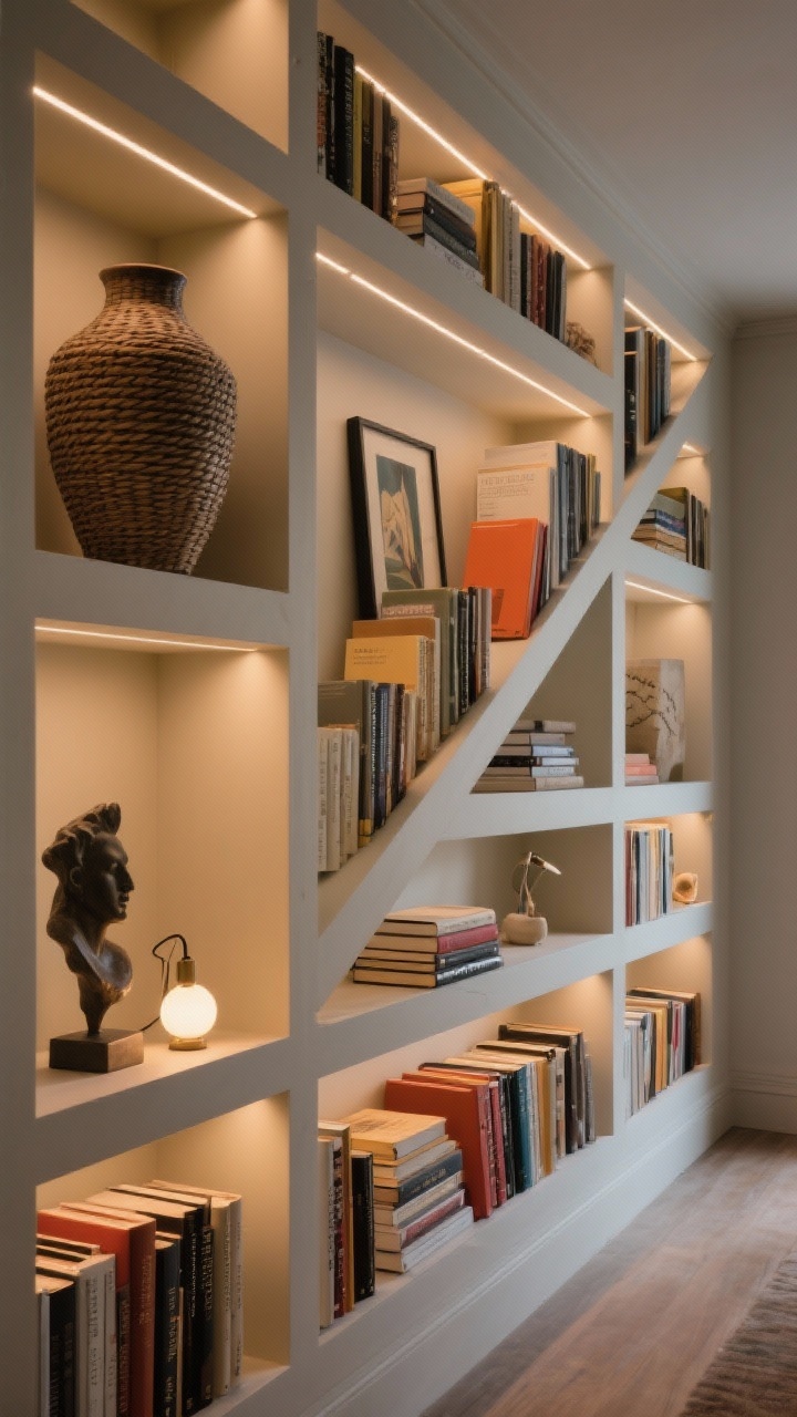
3. Play With Height: The Magic Triad Rule
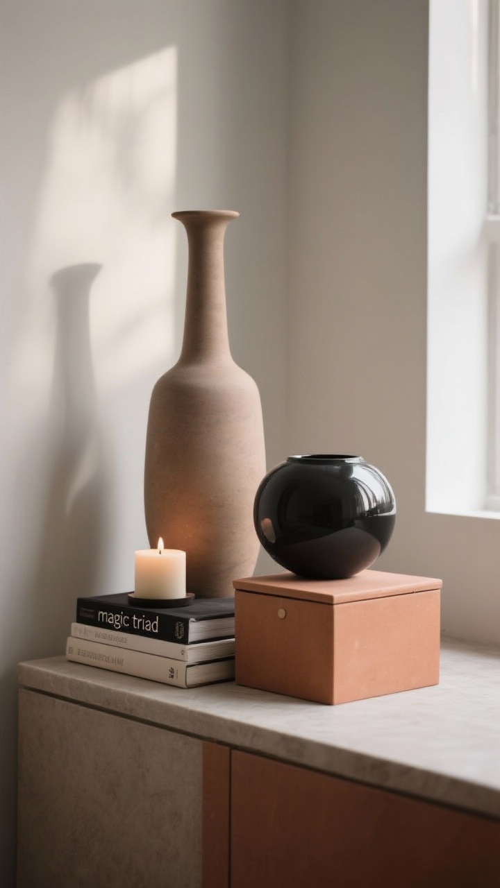
Objects look best in conversation with each other. Use groups of three and vary the heights for instant visual rhythm. It’s like a tiny skyline—tall, medium, short.
Easy Height Hacks
- Stack to lift: Use 2–3 books as a mini pedestal for a candle or a small bowl.
- Mix silhouettes: Pair a tall vase with a round vessel and a low box.
- Top your stacks: Put a sculptural object on a book stack to finish the moment.
Don’t line things up like soldiers. Angle one piece, center another, and let one overlap slightly. A little imperfection reads as effortless.
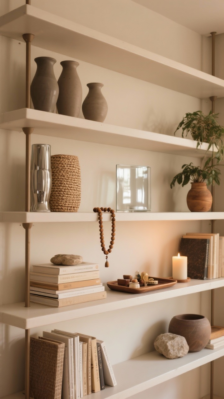
4. Layer Like A Stylist: Depth, Texture, And Shadow
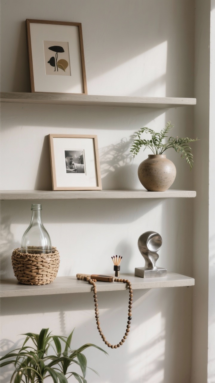
Flat styling = flat energy. Layering adds life. You’re creating depth so the eye moves around happily.
Go Back-To-Front
- Back layer: Lean art, framed photos, or a cutting board-sized object against the wall.
- Middle layer: Medium items—vases, plants, stacked books.
- Front layer: Small accents—beads, match striker, tiny sculptures.
Mix textures like matte ceramics, glossy glass, woven baskets, and metal. That combo adds instant richness. IMO, one plant per two shelves adds just enough life without turning it into a jungle.
5. Curate Your Story: Personal, Useful, And Beautiful
You don’t need to buy a whole cart of knickknacks. Pull from what you already love—just be picky. If it doesn’t fit the vibe, it doesn’t make the cut.
Make It Personal (But Edited)
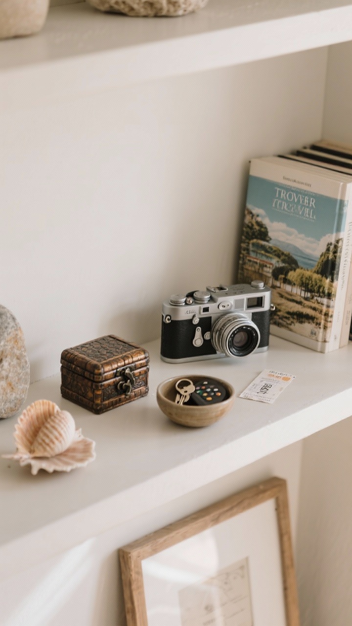
- Personal artifacts: Vintage cameras, travel books, a framed ticket stub—just one or two per shelf.
- Functional items as decor: Beautiful boxes for remotes, bowls for keys, lidded jars for cords.
- Repeat motifs: If you have a shell on one shelf, echo a similar organic shape on another.
Rule of thumb: If everything is special, nothing is special. Let a few hero pieces shine and keep the rest quietly supportive.
6. Balance The Whole Wall: Zigzag The Weight
Now step back and look at the entire unit. Balance isn’t about symmetry; it’s about distributing visual weight so nothing feels lopsided.
Think In Diagonals
- Zigzag heavy items: If a large vase is on the top left, place another substantial piece on the lower right.
- Echo colors: Repeat your accent color every other shelf so it feels intentional.
- Vary orientations: Alternate vertical stacks of books with horizontal stacks for rhythm.
Lighting helps too. Add a small clip-on light, puck light, or mini lamp to warm things up and highlight textures. Instant ambiance.
7. Edit Ruthlessly, Then Add The Finishing Touches
Time for the most important step: editing. Remove one item from each shelf. Yes, really. Space equals chic.
Final Pass Checklist
- Color balance: Do the accents repeat? Any color that sticks out without a friend?
- Heights: Do most groups have tall-medium-short? Any straight lines to soften?
- Texture mix: At least three different textures across the unit?
- Negative space: Every shelf should have room to breathe.
- Shine + life: One reflective element (metal/glass) and one natural element (plant/wood/stone)?
For the finishing moves, try a strand of wooden beads draped over a book stack, a small tray to corral tiny items, or a scented candle. FYI: unscented looks pretty, scented is a vibe—choose based on where the shelf lives.
Bonus Micro-Tips (Because You’ll Ask)
- Open kitchen shelves: Keep 70% functional—plates, bowls, glasses—and 30% decorative like a plant or a cookbook stand.
- Kid-friendly: Use lidded baskets on lower shelves for toy chaos; style the upper shelves for you.
- Small spaces: Go tone-on-tone to reduce visual clutter. Clear glass and light woods are your allies.
Ready to play? Pull everything off, keep only what fits your vibe, and style in layers. A little intention goes a long way—your shelves will look like you hired a stylist, and only you will know it was a Saturday afternoon and a cup of coffee.