7 Two Tone Kitchen Cabinets Ideas That Instantly Elevate Your Cooking Space
Your kitchen deserves main-character energy, not bland beiges and “someday” updates. Two-tone cabinets deliver drama, balance, and style without demolishing your budget. These ideas make your kitchen look custom, airier, and way more interesting. Ready for color combos that actually work in real life?
1. Go Dark On Bottom, Light On Top (Classic, But Make It Chic)
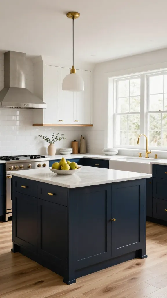
This is the two-tone strategy everyone loves for a reason. Dark lower cabinets ground the room and hide scuffs, while lighter uppers keep things bright and open. Think contrast, but keep it coordinated so it looks intentional, not chaotic.
Winning Combos
- Navy + Warm White: Coastal but polished; brass hardware sings.
- Charcoal + Soft Cream: Modern farmhouse without the clichés.
- Forest Green + Cloud White: Earthy, cozy, and timeless.
Use a satin finish on the lowers for durability and a semi-matte on the uppers for a softer look. Want more cohesion? Match your upper-cabinet color to your walls.
Tips
- Keep your countertop neutral (quartz or marble-look) to bridge the two tones.
- Repeat the darker shade in small doses—barstools, planters, or window trim.
Best for kitchens that need more visual height and strong contrast without feeling heavy.
2. Wrap The Island In A Bold Accent (Statement Central)
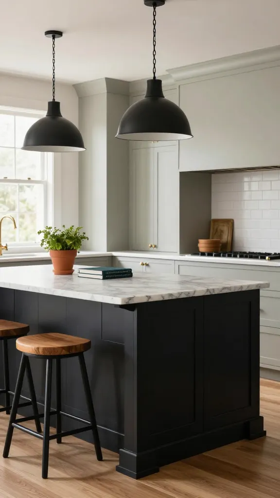
If you fear commitment, start with the island. Paint base cabinets a bold shade and keep wall cabinets neutral. You get personality without overwhelming the room.
Color Ideas That Don’t Miss
- Inky Black Island + Pale Greige Perimeter: Luxe and editorial.
- Deep Teal Island + Crisp White Perimeter: Energetic, not loud.
- Terracotta Island + Mushroom Perimeter: Warm, earthy, cozy.
Anchor the island color with matching pendant shades or a runner that pulls in the hue. IMO, it’s the fastest way to make your kitchen look custom.
Pro Moves
- Use a durable enamel or cabinet-grade lacquer for traffic-heavy islands.
- Consider a butcher-block top on the island for warmth against a stone perimeter.
Perfect for open-concept spaces where the island acts like furniture.
3. Mix Wood Grain With Paint For Organic Contrast
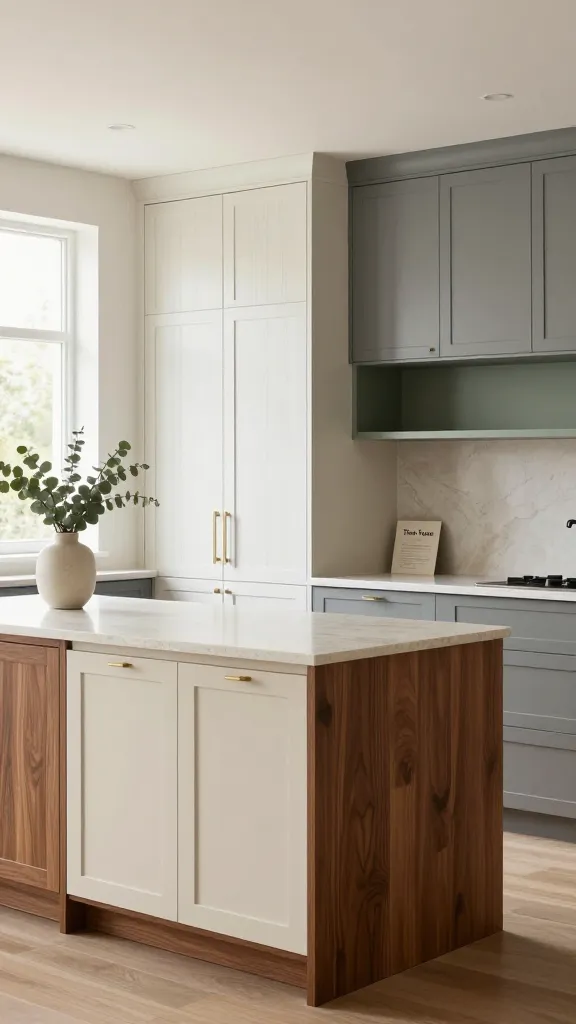
Nothing beats the texture of real wood next to a painted color. It adds depth and warmth that paint alone can’t deliver. The trick: choose one wood tone and one paint shade that feels intentional.
Smart Pairings
- White Oak + Putty Gray: Scandinavian calm, endlessly soothing.
- Walnut + Cream: Rich and refined with zero fuss.
- Rift-Sawn Oak + Sage Green: Modern nature vibes.
Keep wood vertical grain for tall pantry doors and horizontal for drawers to create subtle rhythm. Avoid clashy reds or orange wood if your paint has cool undertones—undertones matter, seriously.
Finishing Touches
- Use matte black hardware to modernize, or unlacquered brass for patina lovers.
- Let the wood be the “pattern” and keep backsplashes quiet.
Great for anyone who wants warmth without giving up that clean, modern feel.
4. Split The Room By Zone: Prep vs. Display
Two-tone palettes don’t have to split top and bottom; you can split by purpose. Paint high-use prep zones darker and keep display or open-shelf zones light. It looks curated and subtly guides how you use the space.
How To Map It
- Prep Wall: Darker lowers and uppers near the range and sink.
- Display Wall: Open shelves or glass uppers in a lighter tone.
- Pantry Units: A third neutral that leans into either zone.
Use a light, reflective color for the open shelving area to make your pretty dishes pop. The darker prep area hides the inevitable splatters because life happens.
Pro Tip
- Repeat the light tone on the ceiling or backsplash to keep the whole look cohesive.
- Choose easy-wipe paint finishes near high-heat and high-grease spots.
Ideal for busy cooks who still want the space to feel styled, not sterile.
5. Monochrome Shades, Different Depths (Same Color Family, Big Impact)
Not into bold contrast? Use one color in two depths—think light greige above, deeper greige below. You get harmony with just enough difference to look elevated.
Palette Examples
- Greige on Greige: Upper cabinets at 25% saturation, lowers at 75%.
- Dusty Blue Duo: Sky blue for uppers, stormy blue for lowers.
- Charcoal Gradient: Mid-charcoal on lowers, whisper gray on uppers.
Ask the paint store to mix the same hue at different strengths. It’s a designer trick that never fails and keeps you from second-guessing undertones.
Details That Seal The Deal
- Use the same hardware across both tones for cohesion.
- Let countertops and backsplash stay neutral so the gradient shines.
Best when you crave calm, minimal vibes with a subtle, layered twist.
6. Frame It Out: Contrasting Rails, Stiles, Or Trim
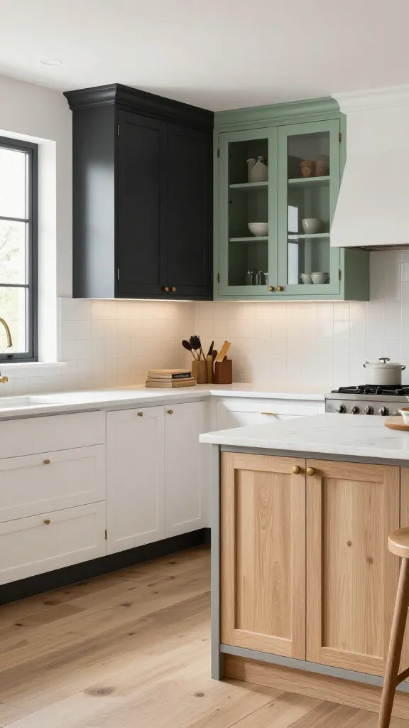
Want custom-cabinet energy without custom-cabinet pricing? Paint the cabinet frames one color and the doors another. It highlights the architecture and adds dimension you can’t get with a single flat shade.
Ways To Play
- Dark Frames + Light Shaker Doors: Graphic and modern.
- Light Frames + Natural Wood Doors: Fresh and organic.
- Color Frames + Glass Doors: Museum-display vibes for your pretties.
Keep the contrast tight—two to three steps apart on the color wheel—or go high-contrast if you’re a maximalist at heart. FYI, this technique shines with Shaker or inset cabinetry.
Execution Tips
- Use high-precision painter’s tape and a sprayer for clean lines.
- Swap standard toe-kicks for furniture-style bases to complete the “custom” look.
Use this when your cabinets have great bones but need a distinct, design-forward identity.
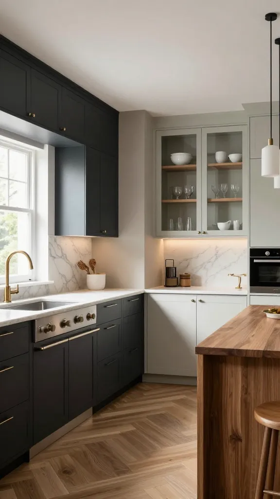
7. Add A Third Quiet Neutral With Backsplash Or Hood
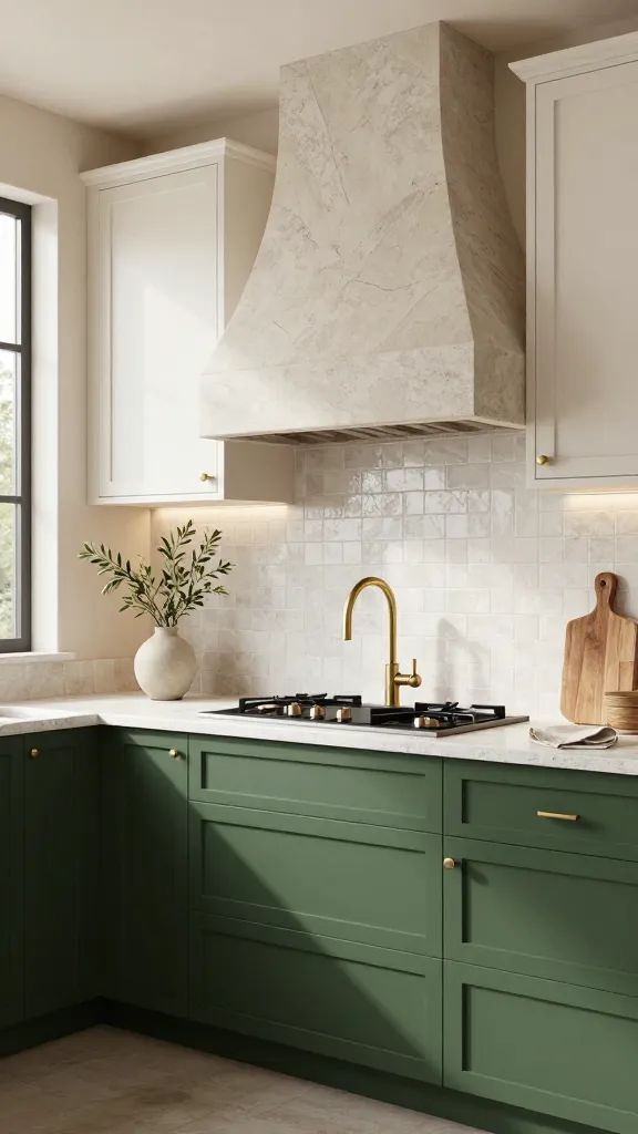
Yes, this list is about two-tone cabinets, but the secret spice is a third quiet neutral in your hard finishes. A stone hood, plaster finish, or soft veined backsplash becomes the peacekeeper between your two cabinet colors. It looks layered, sophisticated, and very “designer came over.”
Harmonizing Elements
- Stone Or Quartz Hood: Echoes countertop veining, bridges upper and lower tones.
- Zellige Or Simple Subway Tile: Texture without noise.
- Roman Clay Walls: Softens high contrast with an earthy wash.
Pick a material that connects to both tones—veining that pulls blue from the lowers and cream from the uppers, for example. Repeat that third neutral with barstool upholstery or window shades to lock it in.
Don’t Forget Lighting
- Warm white bulbs (2700–3000K) make colors read richer and more inviting.
- Mix a slim LED under-cabinet strip with pendants so everything glows evenly.
Great when your two-tone combo feels a tad disjointed and needs a soft mediator.
Quick Planning Checklist
- Sample big: paint at least two full cabinet doors before committing.
- Test day and night lighting—colors shift more than your mood on a Monday.
- Balance metals: one hero finish, one supporting finish. No hardware chaos.
- Mind undertones: pair warm with warm, cool with cool, or deliberately contrast with intent.
- Protect it: finish with a durable topcoat designed for kitchens.
That’s your menu of two-tone greatness. Start with the combo that fits your vibe—bold island, calming gradient, or wood-and-paint harmony—and build from there. Your kitchen’s about to look custom, expensive, and totally you. Trust me, once you go two-tone, you won’t look back.